TITAN READY MIX
The Logo
There are several ready-mix companies servicing Granbury, TX and the surrounding counties. Many of them have decorated their cement mixer drums with various imagery, some belonging to the same company but you would never know due to the lack of consistency in branding. My client Danny saw an opportunity in creating a consistent and visual commanding symbol to brand his ready mix fleet with.
Danny wanted to identify is his company with the fabled might of the ancient spartans. I looked through pre-existing brands and actual spartan helmets to identify key features true to the design as well as subtleties other companies chose to accentuate about the design.
What I’ve created is true to the overall feel of the iconic armor but with enough customization to be unique and withstanding. I topped it off with a gritty metallic texture to mask it in.
The Titan
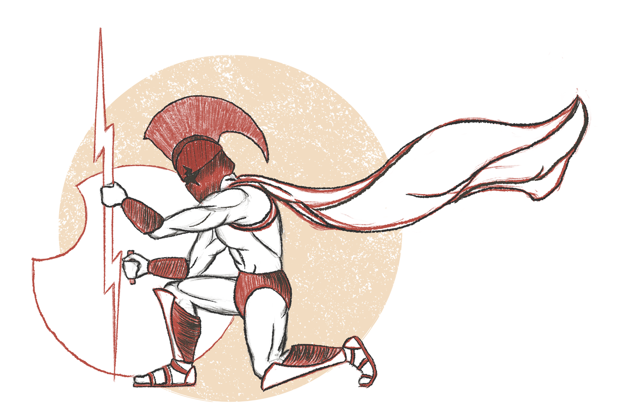
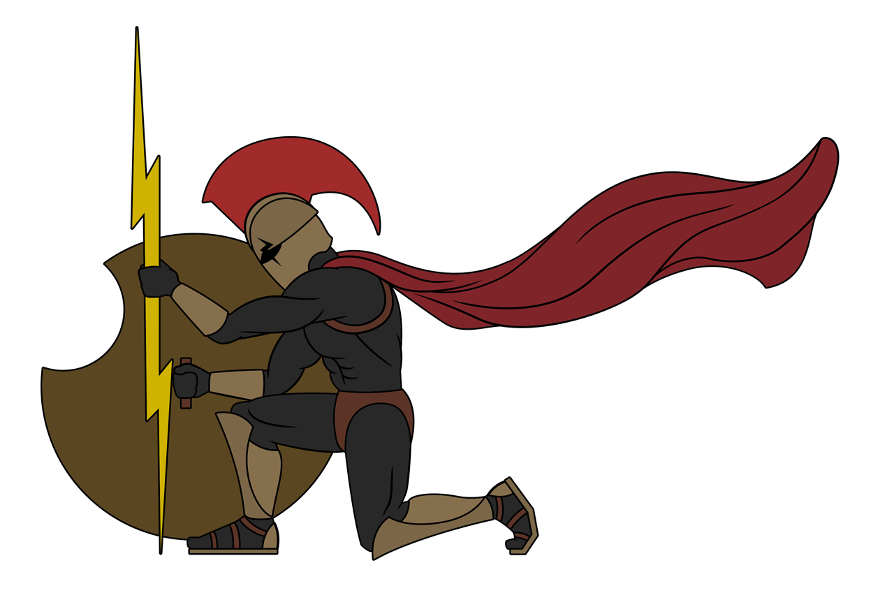
My next creative endeavor for TRM was to create a full-bodied spartan to be featured on each one of the cement-mixers in their fleet. The inspiration came from a stock-photo my client sent me that he discovered on the line.
The reference was a flat illustration of a very stylized spartan with odd proportions. The body was silhouetted with pops of red in the helmets mohawk and the spartan’s cape. I had created the logo to be easily recognized and simple. The metallic texture was added by request and I did not know my client had planned to request a full size spartan as well.
My client wanted the full sized spartan to be similar to the reference provided but I expressed that any additional visual elements had to be created in the same aesthetic as the logo or his brand would look disjointed. I didn’t know quite how I was going to apply the metal texture to entire body and armor and feared that I would need to persuade him to adopt a visual identity with an aesthetic that could work with both the logo and illustration.
Thankfully, I found inspiration in the Black-Figure pottery of ancient Greece that depicted spartan warriors in rigid profiles. By layering the individual elements of the spartan’s anatomy I was able to give the design the look of a metallic relief. I’m very happy with the end product and it’s unlike anything I’ve ever done or seen before.
www.titanmud.com
I created a 1-page website for TRM with a parallax effect featured within the images on the index page’s sections. My clients needed something up quickly and with an emphasis on industry experience, customer service, and attracting qualified drivers.
At the bottom of the site is a section for future clients to obtain and email a credit application in. Additionally, the site provides the viewer with an outlined service area and a gallery of Titan Ready Mix’s fleet and notable jobs.
SERVICE AREA MAP
To further advance the aesthetic I used on the TRM Logo and Spartan, I took a screenshot from the Free Map Tools app that highlighted all the available routes, towns and cities within a 45 min commute. I used the screenshot as the basis for my own map and created a vector tracing to then implement the metal relief aesthetic in Adobe Photoshop.


