Texas tico
THE Process
I’m probably biased, but Texas Tico is the coolest company I’ve been blessed to create for so far. My In-Laws made it a point to travel more than they spent on material riches and of the many tropical get aways they ventured to with my Wife and her sister, Costa Rica was by far their favorite.
Having led successful careers and finally being empty nesters, My in-laws decided to move to Costa Rica for a soft retirement and started a beach rental company focused on taking the little bit of inconvenience of your beach day completely out. The term “Tico” is spanish for a man or guy in Costa Rica. My Father-in-Law Todd wanted to imbue southern hospitality into his business with a little Pura Vida.
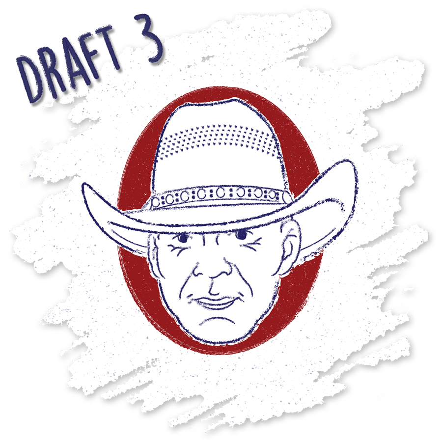
Now you might think that a commission from you family member would be cake but not with my Father-In-Law. Todd David Miller has started, built and sold his own company off a patent for a new shot glass design called Sidekick, decided he wanted to go into advertising in his late 40’s and did just that, as well as play Doom on PS4. The man knows what he likes and is uncompromising in his vision. I struck out on the first two logo mockups and fouled out on the third.
THE LOGOS
As with any client, you hope that at least one of your top mockups has them jumping out of there seat and yelling “THAT’S IT!”, followed by a high five and a plethora of praises about your creative genius. Todd however just stood there, silent, for the longest minute ever.He stated that while they looked good, he was looking for the mark that would make him say “Damn that looks sick, must be a fun company", and none of what I created made him do that. Well, not exactly.
I was back to the drawing board but after about a day he gave me some hope in saying that there was something about draft 3 that he couldn’t stop thinking about. I like the aesthetic a lot with it’s grit and patriotism. I had used some amazing vector brush strokes in a vector line drawing of his face. He wasn’t sold on making himself the actual face of the brand and wanted to see the style employed and some different imagery. After a few rounds of trial and error with some hand drawn sketching, I successfully injected the style into an image of a Howler Monkey and Toucan, both native to Costa Rica.
TEXAS TICO WRAP
The challenge with every visual identity is creating a style and tone that can be expanded across every brand touch point in a seamless fashion so that the identity doesn’t look disjointed. This is why minimal aesthetics in logos are so powerful. I believe that logos are the cornerstone of a brand’s visual identity but I can often make things more difficult for myself by creating a logo with a style that takes time to achieve and longer to replicate when translated to different elements.
The Texas Tico’s needed an eye catching wrap to alert beach goers to their location on the beach since most of their customers have scant service in a foreign country like Costa Rica. Todd wanted the wrap to exhibit the items they offered customers in The Texas Tico VIP Beach Parlor package. I managed to effectively portray several of their key amenities in the design along a simple beach scene with the Howler Monkey Logo front and center.
For the Texas Tico site, I was the front end designer and partnered with a Wordpress developer for the build. I picked the template according to the Texas Tico site needs and designed every page and image in the site aside from the photography. The photos were taken by a photographer in Costa Rica and a few are from Adobe Stock.


