


This new Tang visual identity and rebrand is the culmination of the work I did for my Visual Systems class when I was in the Communication Design program at Texas Tech University.
As a class we were first tasked with the rebrand of company that had since gone under or otherwise was not a prominent as it once was. I chose Tang which if you recall was a orange flavored drink mix that featured orangutans in their commercials and targeted a young audience.
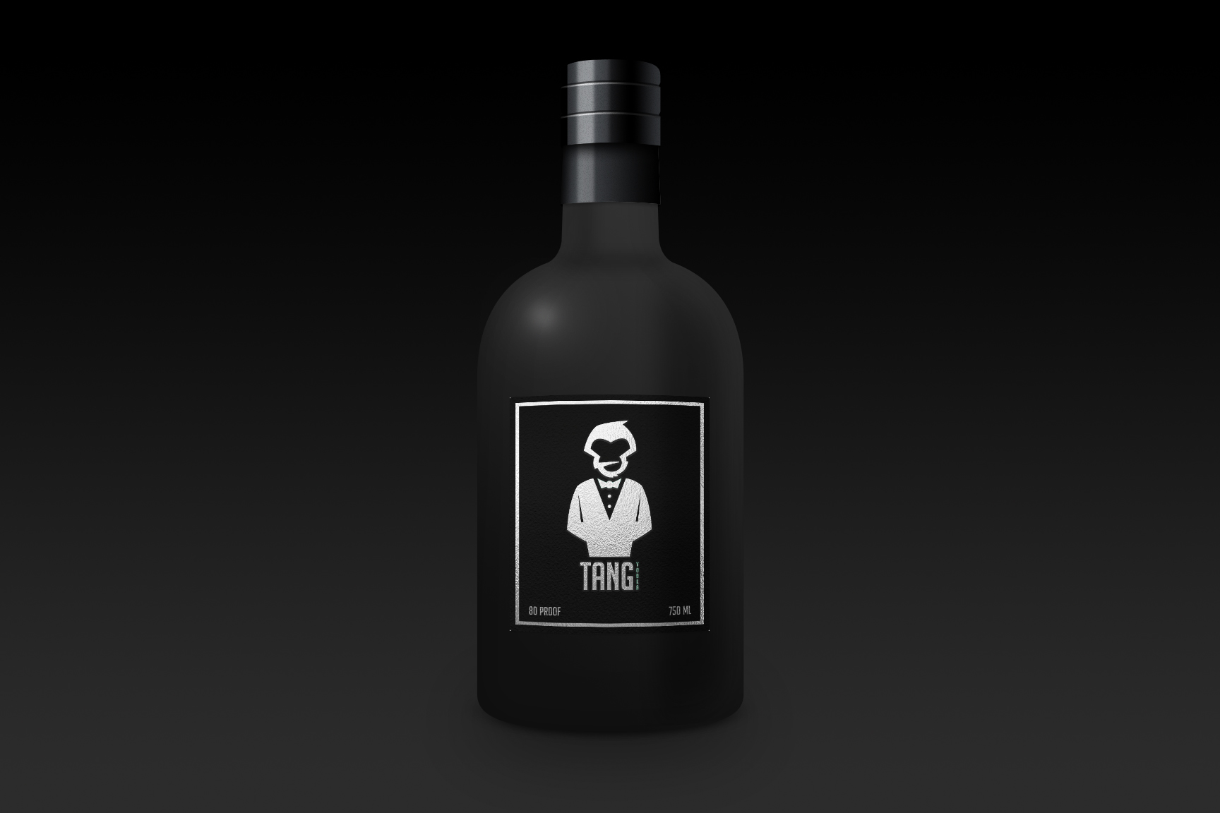
I decided to rebrand Tang as an upscale adult beverage company. Using the nostalgic symbolism of a primate, I designed a sleek and minimal mark of a monkey head with a bowtie. To create the combination mark I employed the font Big Noodle Titling for the name and Androgyne for the the subtle tag line: Evolve.
After creating the initial combination mark for the new Tang brand, I was tasked with expounding upon the new identity by creating a cohesive stationary system.
My vision for the Tang rebrand includes three premier products: Tang Vodka, Tang Pale Ale, and Tang Cabernet Sauvignon. These three combination marks were created to be used solely for the branding of their respective products. I created this for the second project of my Visual Systems course which required that we create promotional materials for our new brand.
A brand isn't what the company says it is, it's what the customer says it is. Company's become household names by consistently and effectively branding themselves visually and through messaging.
For our second project in Visual Systems we were challenged to create the foundation for visual branding. I believe that a logo is the foundation for a brand but it is nothing without context.
For Tang I decided to create posters that would be delivered with Tang products to liquor stores and would be displayed with the product. For each of the three Tang products I created posters to be visual metaphors that would directly tie Tang to famous icons of history.
A visual mockup I created after my Visual Systems course had concluded.
Another visual mockup I created after my Visual Systems course was over.
The final project of my Visual Systems course was to create something that was a logical next step of the rebrand. I decided that it wouldn't be the easiest to execute but a physical Tang Pale Ale 6-pack would be the best opportunity to showcase the potential of my Tang rebrand.
I wanted to immediately distinguish my Tang Pale Ale from any other 6-pack. To do this I looked for a unique carrying case to create. I discovered a cool 6-Pack online and created my own dieline based about what I could see and the measurements I took from a Shiner-Bock beer bottle.
To create the dieline for the 6-pack I used a Shiner-Bock's height & width to map out where I would score and fold my material into the shape of the carrying case. I designed the two sides individually and used darked textures with repeated elements from the Tang Logos to make the composition of my 6-pack.
Pictured here is the dieline I created and designed. I learned a valuable lesson during this project that I won't soon forget. With about 70% of my dieline completed, my Illustrator CS6 crashed due to my heavy use of clipping masks. After a couple of cold ones and some food, I redid the work once again and changed my methods to ensure I wouldn't have to do the work a third time.
I used every opportunity to distinguish my 6-pack from contemporary products. On the inside of my 6-pack carrying case I created a pattern by taking the arms of the Tang Pale Ale logo and repeating them in varying sizes with iconic athletes pasted inside a few.
For the bottles I spray painted Shiner Bock bottles in a high-heat matte black and the bottle caps in a metallic gold to match the gold leaf texture on the logo. The shape of the front label was inspired by tuxedo lapels and inlaid with subtle fabric textures.
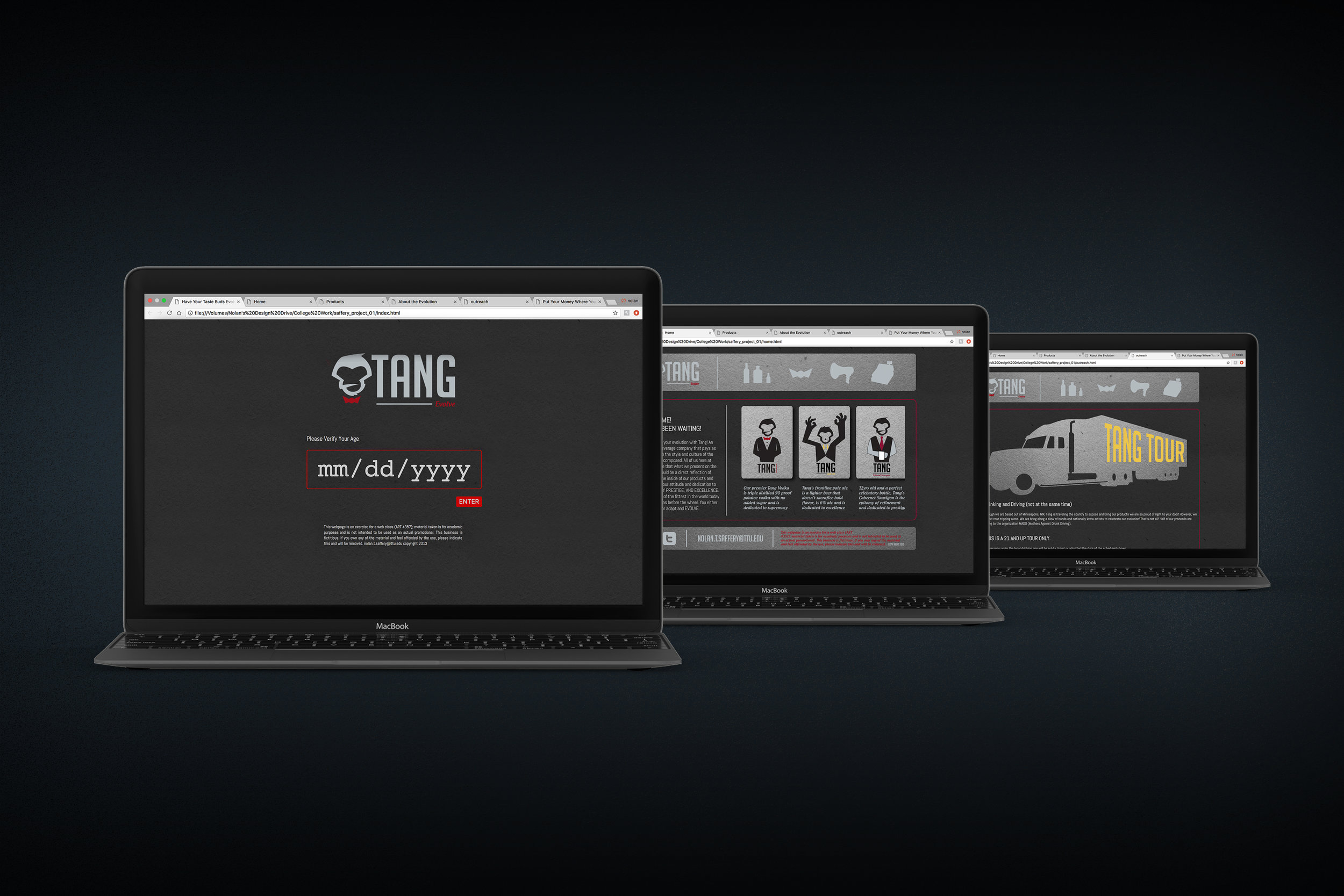
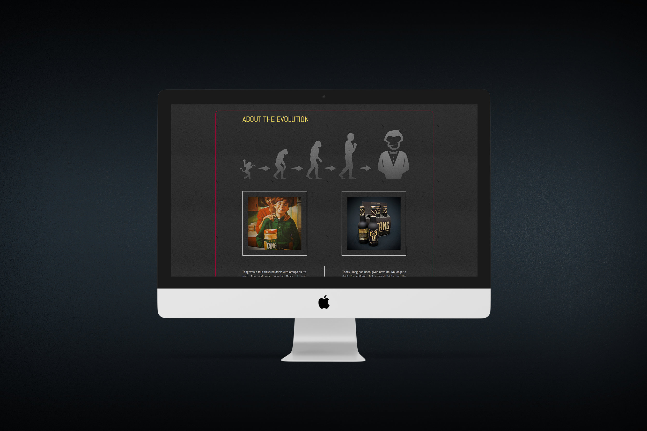
When my visual systems class had concluded I was still curious and hungry to see how much more my rebrand could evolve. Lucky for me, my web-design course provided a new outlet to explore. Our first large project after the basics was of course to create a promotional site to include in our upcoming portfolio reviews. Our assignment was to continue the brand we had developed in Visual Systems.
After a lot of research in looking at other alcoholic beverage company websites, I created mine to be a succinct summary of the rebrand and to have an online order form for distributors and liquor stores to buy the product.
The site turned out well and I was happy with it but if I got the chance to do it over again I would like to make it more minimal and fine tune the tone of the site.
www.tangevolve.com can no longer be visited because it was hosted through my University's server while I was a student. Since graduated I no longer am allow to host anything there for free. If you'd like to see the site in full, the files can be downloaded and viewed in your internet browser.