


My client Keegan Johns, a seasoned financial advisor has provided financial service solutions for his growing book of clients for over 14 years. Mr. Johns came to me in preparation of leaving the nest he was raised in to help lay the foundations of his independent financial planning enterprise.
LuxPlan, a new breed among financial planning institutions, combines the sage advice and fiduciary responsibility Mr. Johns clients have come to love and expect with a culture of celebration and success. Gone are the days when clients forget their advisor exists until a life-changing event calls for an emergency consult to avoid ruin or delay freedom.
At LuxPlan, Clients will learn to expect the unexpected in the form of celebratory events and perks as a side effect of hitting not only financial milestones but the new peaks in life that come with growth. The LuxPlan logo suite reflects the professional reliability Mr. Johns is known for, but also clearly annotates an elevation of status, service, and expectation.
Whereas the visual design trend has predominantly been used in UI components and assets like text and content containers on sleek web pages, LuxPlan utilizes the frosted glass effect to very literally embody the characteristics of its root name.
Lux is latin for light. LuxPlan illuminates paths of fiduciary discipline and financial freedom. The logo employs a glassmorphic effect to elevate the brand identity to be synonymous with light and luxury.
LuxPlan’s icon is the cornerstone of its visual identity. It’s immediately recognizable and sticks within the consumer psyche with ease due to its visual encapsulation of LuxPlan’s root and derivative.
The bottom part of the icon is the silhouette of an open book with the bottom of the top part and negative space of the starburst creating the outline of the open books pages. The light rays at the top emanating from the book represent the truth and wisdom that illuminate our paths to success.
The world is full of out of the box solutions. One size fits all products for the masses that scratch a universal itch. However financial freedom seekers know very well that the once solution that shouldn’t be generic or pulled off a shelf is their money management and growth solutions.
LuxPlan provides bespoke financial plans that are custom tailored to each individual or family. It only makes sense that the logo font should be custom made and reinforce LuxPlan’s promise to produce plans that are custom made customer considerate.
Customers are incredibly intuitive and at the same time contradicting. If you ask most, they’ll freely admit their desire to support small business but when the opportunity arises, comfort is the default mode we resort to.
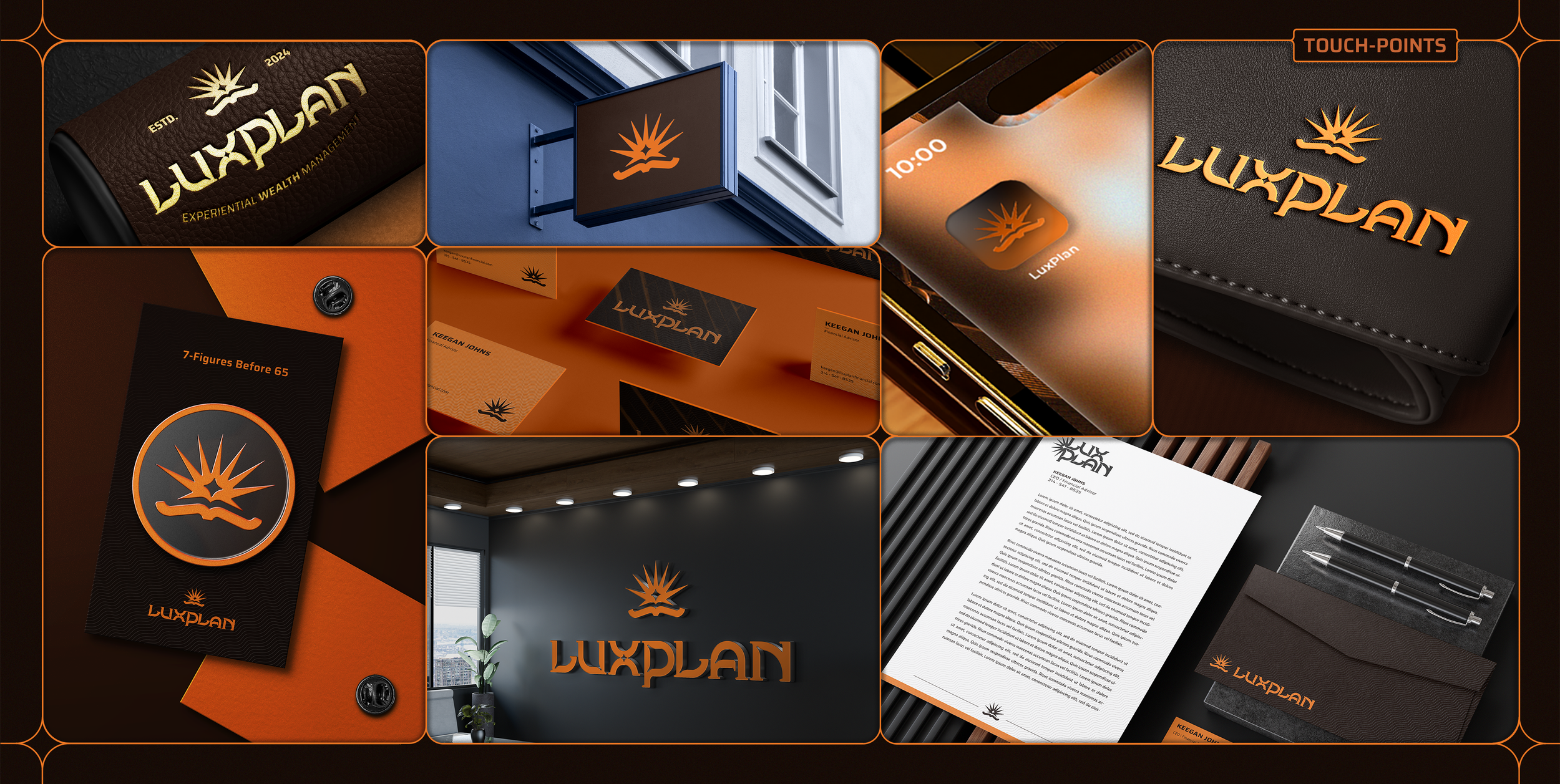
Customers prefer large and established name brands with recognizable identities because they’ve learned those brands can accommodate a reliable experience. To pass the smell test of a well established brand, LuxPlan needed a sweet of logos that can suite a wide range of mediums. Few logos can help a brand scale on its own.
The LuxPlan logo suite leverages several brand marks to enforce recognition in the market at scale across multiple touch-points.
Design serves as a powerful conduit for brand messaging, encapsulating structure, tone, and aesthetic to establish a clear identity. The effectiveness of a brand’s visual communication can be gauged by how swiftly it can be recognized and how deeply its sentiments resonate with consumers. Achieving seamless recognition across various platforms is essential for embedding brand associations in the minds of the audience.
In my work with LuxPlan, I strategically aligned their visual identity with the desired consumer associations. By defining these associations, we premeditated the impression LuxPlan wanted to leave. The creation of touch-point mockups allowed for a tangible representation of the LuxPlan identity, enhancing Keegan's confidence in both the primary and secondary branding elements.